![]()
WHY WAIT UNTIL IT'S TOO LATE!
|
|
|
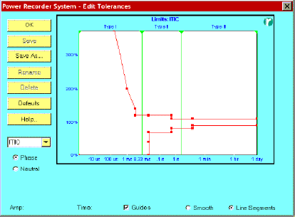
Power Quality Prediction Versus Post-Mortems: Why Wait Until It’s Too Late! Michael Daish What’s the quality of power in your operation? Is it good or bad? Is it getting worse or better? Which points in your delivery system are worse or better compared to each other? The answers to these important questions relate to the reliability of your power system. But they haven’t been easy to answer, until now. Introduction What if you could predict power quality problems so that you could avoid them? Well, it’s now possible with new power monitors. Coupled with predictive maintenance techniques, these instruments bring an entirely new dimension to preventing power problems in electrical distribution systems. Before, you used power monitors only to determine existing conditions on an electrical system or for post-mortem evaluations. Now, newer monitors can predict and help avoid power quality problems that lead to equipment malfunction, overheating of circuits, and system failure. Power quality index A new technique converts accumulated power monitoring data into a single-number index called the power quality index, which you can track over time. By trending this index, you can get advance warning of a deteriorating situation that could lead to system failure. Basically, you give each event an index number that’s calculated by determining its relationship to a power quality tolerance curve (PQTC). You can use any curve, but the standard electronic equipment references are the CBEMA (Computer and Business Equipment Manufacturers Association) curve and the ITIC (Information Technology Industry Council) curve, which is proposed as being the "new" CBEMA curve. Here’s how the indexing works.
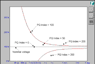
Fig.1. The power quality event for each event is calculated from the event’s relationship to a power quality tolerance curve (PQTC) and nominal voltage.
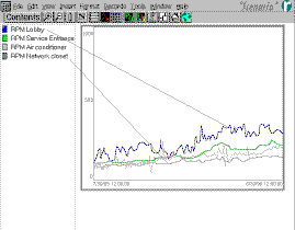
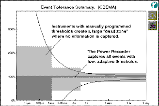
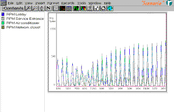
Fig. 2. Power quality mean-index plots taken of the power flowing in the conductors at four different locations within a facility You start by defining the nominal voltage as having an index of zero, as shown Fig. 1, and the index of an event landing on the PQTC as 100. You give other events an index number based on the ratio of the event’s distance from nominal voltage to the same distance from the limits of the PQTC, multiplied by 100. For example, if an event is halfway between nominal voltage and the PQTC, it gets an index of 50. If it’s twice the distance from nominal as it is from the PQTC, its index is 200. You then calculate the mean index at regular intervals, and plot it over time. These plots will show when power quality is deteriorating (index goes up), when it’s improving (index goes down), or if it’s fluctuating. Fig. 2 shows the mean value of power quality index plots for power monitors installed at four locations at a facility. In our example here, the index for the monitor installed in a network closet shows the most stable power situation, while the index for the lobby monitor is going up at the fastest rate and is fluctuating to a greater extent than the other monitors. By comparing the index plots to each other, you can easily see which locations have better (or worse) power quality than others. If the lobby location in Fig. 2 were a critical site, the data indicates it’s the worst of the four locations and is worthy of investigation first. If you allow the index to rise, this location will inevitably suffer undesirable power consequences. This example shows how the power quality index is an effective predictive tool. By taking action at a particular location, the index plot will soon confirm that your action was appropriate: It will go down and then stabilize. Previously, this would involve a time-consuming analysis of large computer files or paper tapes, studying event by event. Indexing quickly and intuitively provides confirmation that the power quality situation is improving (or getting worse). Reshaping the curve There’s an important advantage in linking the index to a power quality tolerance curve: If the curve doesn't exactly describe the sensitivity of a critical load, you can reshape the PQTC to correctly describe this sensitivity. As such, the index plot will provide better prediction. For example, suppose you plot an event against a CBEMA curve. If the index of this event is less than 100 it could lead you to believe it’s safe when in reality it causes disruption. The event could actually be greater than 100, according to real world performance. In predictive maintenance programs, you want to know when events have an index greater than100, and you want to track the index to make sure events (and the index) always stays below 100. By using a modified, more accurate curve, you’ll be better informed and alerted to events that could potentially cause failure or disruption. Developing your own curve Suppose you don’t know the exact shape of the PQTC describing a critical load’s operational limits. And, suppose the standard CBEMA curve doesn’t quite fit. Furthermore, the equipment supplier can’t supply a curve. Now, what can you do? The answer: Develop your own specific PQTC for predictive maintenance by fine-tuning a standard curve. Let’s say your equipment is more sensitive to impulses or to high-speed transients. All you have to do is adjust the PQTC to be more sensitive in the microsecond region, giving the correct indices to events in the impulse (microsecond) region. Start with the standard CBEMA curve and note which events cause actual equipment problems. Then, modify the curve so that it correctly describes your equipment sensitivity. In full-disclosure power monitors, you can automatically plot events against any PQTC. Remember, the curve is just an overlay; it has no effect on how you capture the events. Software tools are available for a PC to modify any PQTC at any time, even after you’ve collected data. Because this data resides in a database, you can recalculate the power quality index at any time simply by changing the curve. Highlighting trends Another method of evaluating what’s happening to your system uses color to distinguish events according to age. The software in full disclosure monitors shades oldest events the darkest and shades recent events the brightest. Color shading gives you an easier way of spotting trends and migration effects that show how conditions are becoming worse (or better) over time. Clouds of events, whose perimeters are brighter than the inside, indicate a region where problems are expanding. If the center of a cloud of events is brighter, problems are consolidating in one area. With the tools described it’s easier to prevent a deteriorating situation from getting worse since you’ll easily notice how minor events grow over time and when they are beginning to go outside of the curve limits. With threshold-type monitors you wouldn’t be aware of a problem until disturbances eventually grow to the point where they exceed the threshold limits before they are captured. At this point in time, damage to sensitive equipment may have already occurred. For engine-generator sets, by frequently analyzing the engine’s lubrication oil and monitoring the heat and vibration of the bearings, it’s possible to provide early warning of impending failures. Armed with such monitoring data, maintenance can be scheduled and weak bearings and other parts replaced when it’s convenient. Similar early warning of incipient problems in an electrical distribution system can now also be achieved. By using monitoring instruments that capture all aspects of power information, and by using powerful software tools that analyze trends in power quality and harmonics, deteriorating conditions can be identified and suitable action taken. Comparing historical data You can set up a predictive maintenance program by installing monitors at critical locations, with each monitor making a survey for a "business-period" such as a week or month. With the survey finished, you download the data into a database and reset the monitor to make another survey. Then, you archive survey databases and compare them periodically. Multiple databases collected over long periods of time give you a complete power history of your operation and infrastructure activity. And by continuously tracking the changes and comparing events and trend data on a weekly or monthly basis, you’ll note those conditions that are deteriorating. Increases in event activity, event amplitude, or the emergence of new types of events, are indications of potential problems. Full-disclosure technology Power monitoring instruments capable of providing "full-disclosure" information are a breakthrough development that has made predictive maintenance possible for electrical distribution systems. These instruments use digital signal processing and high-speed sampling to capture and store all aspects of power (i.e., power disturbances, harmonics, flicker, and power consumption) in a database on an internal hard drive. The data is then downloaded into a personal computer for analysis and reporting. These monitors differ from previous versions in that they do not require the user to program triggers, thresholds, or set-points to isolate power disturbances. Instruments that use thresholds, etc., to capture events "by exception" are suitable for performing postmortems, but cannot be used in a proactive, predictive maintenance program. Setting thresholds eliminates vast areas of the power tolerance curve, creating a "dead zone" as shown in Fig. 3. Thus, these instruments are blind to conditions that are "bubbling under" the threshold limits. Without this information you will be unaware of a deteriorating power situation until trigger values are exceeded, when it is too late. The key advantage of full-disclosure monitors is that they record not only the severe events but also the underlying quiescent data that indicates incipient problems.
Fig. 3. Thresholds create a "dead zone" that is blind to deteriorating conditions. It is important that the initial survey establishes the true baseline conditions to provide the basis for comparing initial survey data to subsequent data. And this data must be obtained with a high degree of integrity. It is also equally important that each subsequent database is a true record of all of the conditions at each moment in time. Full-disclosure instruments faithfully record the true conditions at the inception of the predictive maintenance program and on an on-going basis. They also consistently capture and analyze data the same way every time they are used. Predictive maintenance analysis can only be performed by comparing data from instruments with identical data capture techniques, using the same analysis methods, and with full information about the conditions at the monitoring site. You cannot perform predictive maintenance analysis by attempting to compare data between instruments with different threshold settings, using different analysis methods, and with partial information about the conditions at the monitoring site. Portable monitors can perform predictive maintenance The greatest benefits of predictive maintenance are realized with a network of permanently installed monitors, Fig. 4. However, portable trouble-shooting instruments can also be used in predictive maintenance programs providing they are the full-disclosure types. For example, a portable monitor is installed at a location where power quality is of concern, such as at an adjustable speed drive, or at a computer, or at the output of an UPS. You monitor the power to the equipment for a reasonable period (24 or 48 hours), and archive the monitoring data. The monitor is moved on to other locations to perform more surveys, and their data is also archived. At some later date, perhaps a month later, you return to the first location and perform a survey again.
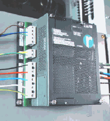
Fig 4. The Reliable Power Meters Multipoint Power Recorder shown installed in a switchboard as part of a power-quality monitoring network at a data center for a major bank. By repeating the above procedure over weeks or months, several power survey databases will have been archived. They are imported into the predictive maintenance software and the index is plotted for each location, Fig. 5. There will be gaps in the plots since monitoring was not continuous, but the index will still indicate whether the power is improving or deteriorating. If equipment problems develop, consulting the index would lead you to include (or eliminate) power quality as a cause before investigating other causes such as hardware or software bugs.
Indexing software simplifies the task of analyzing large volumes of power monitoring data captured by full-disclosure monitors. By turning the data into useful information you can better understand the power quality situation of your electrical system. This procedure is an effective means to trend an index for predicting incipient problems. As the saying goes "to be forewarned is to be forearmed." By being armed with predictive knowledge of your electrical system, you can take corrective action before a problem shuts your system down.
BACK WHITE PAPERS
|
HOME
|